很久没写博客了,因为一些事情耽搁了,现在我们来学习下ConstraintLayout1.1版本的新特性。
准备
首先先将约束布局更新至最新1
2
3dependencies {
implementation 'com.android.support.constraint:constraint-layout:1.1.1'
}
开始
Circular Positioning
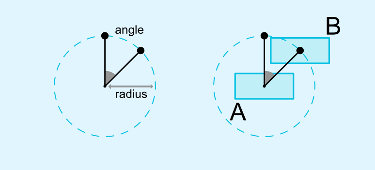
简单来说就是圆的弧度约束,通过设置角度和半径来对一个控件进行类似于把一个控件放在圆上面。
具有三个属性:
layout_constraintCircle约束的控件的idlayout_constraintCircleRadius约束距离圆心的距离,也就是圆的半径layout_constraintCircleAngle约束的角度(0-360度)
举个例子:1
2
3
4
5
6
7
8
9
10
11
12
13
14
15
16
17
18
19
20
21
22
23
24
25
26
27
28
29<android.support.constraint.ConstraintLayout
xmlns:android="http://schemas.android.com/apk/res/android"
xmlns:app="http://schemas.android.com/apk/res-auto"
xmlns:tools="http://schemas.android.com/tools"
android:layout_width="match_parent"
android:layout_height="match_parent">
<Button
android:id="@+id/btn_1"
android:layout_width="wrap_content"
android:layout_height="wrap_content"
android:text="Button1"
app:layout_constraintBottom_toBottomOf="parent"
app:layout_constraintEnd_toEndOf="parent"
app:layout_constraintStart_toStartOf="parent"
app:layout_constraintTop_toTopOf="parent"/>
<Button
android:id="@+id/btn_2"
android:layout_width="wrap_content"
android:layout_height="wrap_content"
android:text="Button1"
app:layout_constraintCircle="@+id/btn_1"
app:layout_constraintCircleAngle="45"
app:layout_constraintCircleRadius="150dp"/>
</android.support.constraint.ConstraintLayout>
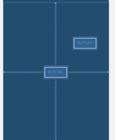
平时我们算角度的时候是从右边开始算角度的,而这里是从顶部开始算的,所以上面的代码显示的内容就是下面那样的
有了这种圆形的约束,那么我们在做一些圆形旋转动画的时候就会很好写了,只需要在ConstraintLayout.LayoutParams的属性里面设置circleAngle的值就能轻松的旋转了:1
2
3
4
5
6val angle = 100f
btn_1.setOnClickListener {
val layoutParams = btn_2.layoutParams as ConstraintLayout.LayoutParams
layoutParams.circleAngle = angle
btn_2.layoutParams = layoutParams
}
点击之后,就把btn_2给移到角度为100那里了。
Enforcing constraints
控件宽高为WRAP_CONTENT的时候,会用到maxWidth和maxHeight这两个属性来实现控件的最大宽高,但是在约束布局中不起作用了:
1 |
|
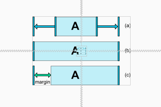
可以看出maxWidth和maxHeight在约束布局里面是不起作用的,在1.1里面就引入了WRAP_CONTENT : enforcing constraints强制约束的属性:
app:layout_constrainedWidth="true|false"app:layout_constrainedHeight="true|false"
同时加入新的控制最大值最小值的属性:
layout_constraintWidth_min和layout_constraintHeight_min同minWidth属性layout_constraintWidth_max和layout_constraintHeight_max同maxWidth属性
设置新的属性之后:1
2
3
4
5
6
7
8
9
10
11
12
13
14
15
16
17
18
19
20
21
22
23
24
25<ImageView
android:id="@+id/image1"
android:layout_width="wrap_content"
android:layout_height="wrap_content"
android:src="@drawable/dimension_match_constraints"
app:layout_constraintBottom_toBottomOf="parent"
app:layout_constraintEnd_toEndOf="parent"
app:layout_constraintStart_toStartOf="parent"
app:layout_constraintTop_toTopOf="parent"
tools:ignore="ContentDescription"/>
<ImageView
android:id="@+id/image2"
android:layout_width="wrap_content"
android:layout_height="wrap_content"
app:layout_constrainedWidth="true"
app:layout_constrainedHeight="true"
app:layout_constraintWidth_max="50dp"
app:layout_constraintHeight_max="50dp"
android:src="@drawable/dimension_match_constraints"
app:layout_constraintBottom_toBottomOf="parent"
app:layout_constraintEnd_toEndOf="parent"
app:layout_constraintStart_toStartOf="parent"
app:layout_constraintTop_toTopOf="parent"
tools:ignore="ContentDescription"/>
效果是跟之前是一抹一样的

MATCH_CONSTRAINT dimensions
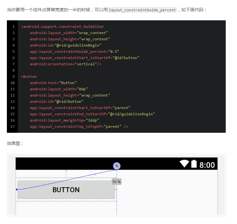
约束布局中的match_parent被MATCH_CONSTRAINT代替了,还记得我们之前是如何实现一个控件实现占屏幕宽度的一半是怎么操作的吗?
在1.1之后添加了三个属性,来实现对MATCH_CONSTRAINT属性的宽高控制:
layout_constraintWidth_min和layout_constraintHeight_min同minWidth属性layout_constraintWidth_max和layout_constraintHeight_max同maxWidth属性layout_constraintWidth_percent和layout_constraintHeight_percent根据父布局的百分百设置长款
现在我们实现一个控件实现占屏幕宽度的一半,是什么样子的呢?1
2
3
4
5
6
7
8
9
10
11
12
13
14
15
16
17
18
19
20
21
22
23
24
25
26<Button
android:id="@+id/btn1"
android:layout_width="0dp"
android:layout_height="wrap_content"
android:text="Botton11111111111111"
app:layout_constraintStart_toStartOf="parent"
app:layout_constraintTop_toTopOf="parent"
app:layout_constraintWidth_percent="0.5"/>
<Button
android:id="@+id/btn2"
android:layout_width="0dp"
android:layout_height="wrap_content"
android:text="Botton11111111111111"
app:layout_constraintStart_toStartOf="parent"
app:layout_constraintTop_toBottomOf="@+id/btn1"
app:layout_constraintWidth_max="100dp"/>
<Button
android:id="@+id/btn3"
android:layout_width="0dp"
android:layout_height="wrap_content"
android:text="Bo"
app:layout_constraintStart_toStartOf="parent"
app:layout_constraintTop_toBottomOf="@+id/btn2"
app:layout_constraintWidth_min="200dp"/>
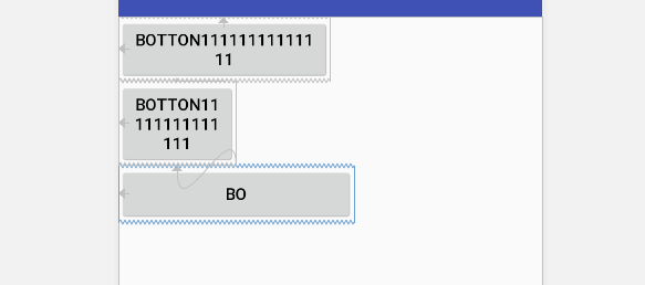
这样就实现了,是不是感觉比之前用GuideLine实现要简单的多呢。
在MATCH_CONSTRAINT可以实现WRAP_CONTENT的效果,设置layout_constraintWidth_default属性值为wrap,默认值是spread:1
2
3
4
5
6
7
8
9
10
11
12
13
14
15
16
17
18
19
20
21<Button
android:id="@+id/btn1"
android:layout_width="0dp"
android:layout_height="wrap_content"
android:text="Botton1111111111111111111111111111111"
app:layout_constraintStart_toStartOf="parent"
app:layout_constraintTop_toTopOf="parent"
app:layout_constraintEnd_toEndOf="parent"
app:layout_constraintWidth_default="spread"
app:layout_constraintWidth_percent="0.5"/>
<Button
android:id="@+id/btn2"
android:layout_width="0dp"
android:layout_height="wrap_content"
android:text="Botton1111111111111111111111111111111"
app:layout_constraintStart_toStartOf="parent"
app:layout_constraintTop_toBottomOf="@+id/btn1"
app:layout_constraintEnd_toEndOf="parent"
app:layout_constraintWidth_default="wrap"
app:layout_constraintWidth_percent="0.5"/>

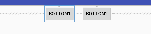
Margins and chains
在1.1之后,Chains里面设置margin属性的时候,值是可以叠加的1
2
3
4
5
6
7
8
9
10
11
12
13
14
15
16
17
18
19
20
21
22
<Button
    android:id="@+id/btn1"
    android:layout_width="wrap_content"
    android:layout_height="wrap_content"
    android:text="Botton1"
    app:layout_constraintHorizontal_chainStyle="packed"
    android:layout_marginEnd="10dp"
    app:layout_constraintEnd_toStartOf="@+id/btn2"
    app:layout_constraintStart_toStartOf="parent"
    app:layout_constraintTop_toTopOf="parent"/>

<Button
    android:id="@+id/btn2"
    android:layout_width="wrap_content"
    android:layout_height="wrap_content"
    android:text="Botton2"
    android:layout_marginStart="10dp"
    app:layout_constraintEnd_toEndOf="parent"
    app:layout_constraintHorizontal_chainStyle="packed"
    app:layout_constraintStart_toEndOf="@+id/btn1"
    app:layout_constraintTop_toTopOf="parent"/>
Barrier
Barrier(屏障)与GuideLine一样,也是属于Virtual Helper objects。先来看看屏障的属性:
barrierDirection屏障对应的方向,值为top、bottom、start、end、left、right。constraint_referenced_ids需要控制的控件id,用,隔开,中间不能使用空格,如text1,text2。barrierAllowsGoneWidgets当控制的控件被设置为GONE的时候,则屏障创建会在GONE掉控件已解析的位置上进行创建,默认是true。
我们来开这样的一个场景,我们有三个控件,其中两个控件是需要根据不同条件只显示一个控件的,这个时候第三个控件如果要约束那两个控件,只能将那两个控件放到一个新的布局里面,然后第三个控件来约束这个布局。大概的代码是下面那样1
2
3
4
5<LinearLayout>
<TextView/>
<TextView/>
</LinearLayout>
<TextView/>
这样操作就不符合约束布局的理念了,所以在1.1引入了屏障Barrier的控件。
1 | <TextView |
然后我们来看一下barrierAllowsGoneWidgets,默认是true,我们来看看下面的布局1
2
3
4
5
6
7
8
9
10
11
12
13
14
15
16
17
18
19
20
21
22
23
24
25
26
27
28
29
30
31
32
33
34
35
36
37
38
39<TextView
android:id="@+id/text1"
android:layout_width="wrap_content"
android:layout_height="wrap_content"
android:text="TextView1"
app:layout_constraintStart_toStartOf="parent"
app:layout_constraintTop_toTopOf="parent"/>
<TextView
android:id="@+id/text2"
android:layout_width="wrap_content"
android:layout_height="wrap_content"
android:text="TextView2"
app:layout_constraintStart_toStartOf="parent"
app:layout_constraintTop_toTopOf="parent"/>
<android.support.constraint.Barrier
android:id="@+id/barrier"
android:layout_width="wrap_content"
android:layout_height="wrap_content"
app:barrierDirection="bottom"
app:constraint_referenced_ids="text1,text2,button"/>
<TextView
android:id="@+id/text3"
android:layout_width="wrap_content"
android:layout_height="wrap_content"
android:text="TextView3"
app:layout_constraintStart_toStartOf="parent"
app:layout_constraintTop_toBottomOf="@+id/barrier"/>
<Button
android:id="@+id/button"
android:layout_width="wrap_content"
android:layout_height="wrap_content"
android:text="Button"
tools:layout_editor_absoluteX="120dp"
tools:layout_editor_absoluteY="192dp"
tools:ignore="MissingConstraints"/>
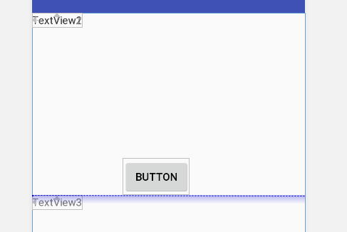
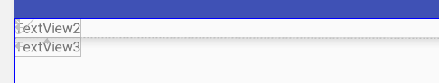
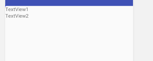
当我们对Button隐藏的时候,TextView3的位置是这样的
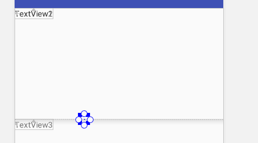
可以看出,默认的屏障是会在GONE的控件创建的位置显示,如果我们把barrierAllowsGoneWidgets属性设置为false会是怎么样的呢?

结果就是会忽略掉那个GONE的控件。
Group
Group与Barrier一样,也是属于Virtual Helper objects。顾名思义,Group一个组的控件,通过设置一组的控件id,来达到分组的目的。
想想这样的情况,在我们针对多个控件进行显示隐藏的时候,通常要写很多的setVisibility的代码,但是在1.1之后,直接设置Group的显示和隐藏就可以了。
1 | <TextView |
是不是觉得方便了很多,不需要那么多的代码。。。